
I posted the LotFP Weird Fantasy Role-Playing cover art yesterday, if you missed it.
And now, the BEHIND THE SCENES story!
The original plan was to do a photograph. My wife was going to do all the costumes and the snake demon was only going to have two arms. The Flame Princess would have had a shield to hide the "transition area" between the human and snake bits of the demon (the snake bit was to be digital manipulation of course).
Arranging that quickly became a nightmare, and there was doubt that the final product would look authentic. Arranging models, figuring out costumes (and cost!), locations, getting it done before the snow melted, finding a snake to photograph for that part and getting it inserted in... uggh uggh uggh.
Time to look for artists.
The Flame Princess was originally going to have a Viking outfit in the photograph. Fairly easy to make. But since it was now going to be art, I could be a bit more extravagant.
So the idea became "Female Solomon Kane type versus the Snake Demon!"
A bit of the Solomon Kane bits didn't survive the various drafts (there were other elements like the hat and a pack which were supposed to be in to make it a more "realistic" scene - this woman isn't traveling across the wilderness with nothing but a sword - but it ended up cluttering the image), but I'm not complaining about that at all. But that was the original idea of the artistic rendition of the Flame Princess.
With it being art, the snake demon could then have 6 arms and we could see the full body without it looking any faker than the rest.
The simple setup for the cover was a necessity because putting together a good looking photo demanded a simple idea. But when I decided to have it rendered artistically, the concept didn't change at all. A bit odd, in retrospect.
The artist selection was tough. My original budget for the cover art was $250. And I could have gotten a decent artist who did good stuff for that amount. But looking through my classic RPG stuff, if I had my choice of a TSR artist to do this, it would have been Keith Parkinson. Now he's no longer with us, and I couldn't afford him if he was, but that was my standard. I wasn't going to get that standard for $250. It was clear that my whole concept of budget for the box set was about to explode.
Choosing the artist was difficult in the end. It was down to Cynthia Sheppard and Nicole Cardiff. I don't know if it's proper etiquette to mention the person I didn't choose, but it was pissing me off for awhile that I couldn't afford both. And I could only have one cover. Both are absolutely awesome, and both make fantastic situations look real. How the hell was I supposed to pick?
In the end, I just had to make a choice. Cynthia did a great job, but of course I'll always wonder what it would have looked like if I'd gone the other way. (would have also happened in reverse if I'd chosen Cardiff)
I can't currently afford this kind of art for every release (and I know it seems rather unkind to all the other artists I work with to say that, but I'd like to think we're not all bullshitting each other and blowing smoke up each others' asses when we work together... and just the front cover for this box has cost far more than any previous project's TOTAL budget), but I hope the box set does well enough that future big releases get made so I can commission more fancy art. I have ideas for a few new color pieces if Weird Fantasy Role-Playing needs a second printing done (would be a color hardcover book rather than a box set - I'm already dreading assembling those things), and I'd want to continue to work with Sheppard because I like visual continuity, but I will find something for Cardiff to do in the future.
So that was all settled.
Oh wait, it wasn't. Good art needs models.
Finding a model for the snake demon was easy. I had four or five people (can't remember now) with the right physique (slender and no huge bazongas which would look gratuitous on the page) ready to do it. That blows my mind. Luna was chosen because she was by far the most enthusiastic about the whole thing, and she had the real-life long hair. The closer the reference is to the final picture, the more real the final picture would look. Luna also does modeling on her own, and knows photographers in her area, and she passed along over TWO HUNDRED AND FIFTY reference photos to Sheppard. I think that really shows in the final piece.
(the winter background was less of a problem... I had taken a ton of reference photos here over the winter, but of course this was the year that there were massive snowstorms all over the US, so Cynthia was able to be more familiar with snowy landscapes than I think she cared to be, haha)
The Flame Princess was a pain in the ass to find a model for (and that's the fully-clothed one!). In my single days, I had a rule. If it has red hair, or long hair, chase it. So I had quite a selection of redheads and longhairs on my contact lists, and it was time to go hunting once again. Marjut was the first person I asked because she's got the best hair ever, and she said no. Over the course of the next month or so, I bugged the shit out of so many people, and I think due to my wish to be as close to the part as possible, and as usual, I overdid it. This is probably why when I was dating, I'd go out with so few redheads or longhairs. I just creep the shit out of them. I think I was responsible for at least one severe haircut and one dye job because I made them hate their hair. ay ay ay. I came crawling back to Marjut, and after some begging, she agreed. She set up a session with a guy that does a lot of concert photography and delivered a couple dozen reference shots to the artist (with a carpet beater standing in for a sword...).
So then it was on.
For awhile, everything was OK. Planning and every prelim piece looked awesome. But then it got too finished, and...
OK. I've mentioned before that I'm an asshole when it comes to art. Sometimes I don't communicate my wishes very well and the impression I give with the art specs isn't actually what I mean. Sometimes I communicate it quite well but seeing what something looks like sometimes just isn't as cool as it was when I was just imagining it. So I request changes. Tons of changes. Back and forth.
Ask Dean Clayton, who isn't getting paid a tenth of what Sheppard is for interior pieces and there are a couple of those we've been going back and forth with for months. Remember my Erol Otus rant some months back? Well I don't just do that on the blog. I was in talks with another classic TSR artist (that I won't name) for a black and white interior piece, we'd agreed on the content and the price, and when it came time to talk specifics, I wanted to make sure I was getting the best he had to offer, and gave specific notes about which pieces of his work I liked and which I considered substandard. That killed the whole deal, but I don't mind. I'd rather that happen before any work starts then get into a "this is crap, why don't I get your good stuff?" argument when a final piece is submitted. The fact is none of these artists' reputations are going to be made or broken on my game, but my reputation very well depends on their work. I behave accordingly.
So yeah, so early on everything was awesome with the cover, but as it got towards the end it seems nothing was good enough. "Change this, change that!" I admit to being awful and probably unreasonable. It's not like I know how other art directors deal with things but I know I have a rather abrasive personality at times so I'm always worried that the next adjustment or criticism I have is the one that's going to make an artist say "Oh fuck this, I quit!" And lately, that's freaked me out. It's a late date to try to recommission such a big piece of art.
On the other hand, the piece turned out how I want in the end, so maybe I'm not so awful or unreasonable?
Here are the original design notes I sent to the artist, three different emails, so you can see how the early concepts changed as work continued:
then
and
And now, the BEHIND THE SCENES story!
The original plan was to do a photograph. My wife was going to do all the costumes and the snake demon was only going to have two arms. The Flame Princess would have had a shield to hide the "transition area" between the human and snake bits of the demon (the snake bit was to be digital manipulation of course).
Arranging that quickly became a nightmare, and there was doubt that the final product would look authentic. Arranging models, figuring out costumes (and cost!), locations, getting it done before the snow melted, finding a snake to photograph for that part and getting it inserted in... uggh uggh uggh.
Time to look for artists.
The Flame Princess was originally going to have a Viking outfit in the photograph. Fairly easy to make. But since it was now going to be art, I could be a bit more extravagant.
So the idea became "Female Solomon Kane type versus the Snake Demon!"
A bit of the Solomon Kane bits didn't survive the various drafts (there were other elements like the hat and a pack which were supposed to be in to make it a more "realistic" scene - this woman isn't traveling across the wilderness with nothing but a sword - but it ended up cluttering the image), but I'm not complaining about that at all. But that was the original idea of the artistic rendition of the Flame Princess.
With it being art, the snake demon could then have 6 arms and we could see the full body without it looking any faker than the rest.
The simple setup for the cover was a necessity because putting together a good looking photo demanded a simple idea. But when I decided to have it rendered artistically, the concept didn't change at all. A bit odd, in retrospect.
The artist selection was tough. My original budget for the cover art was $250. And I could have gotten a decent artist who did good stuff for that amount. But looking through my classic RPG stuff, if I had my choice of a TSR artist to do this, it would have been Keith Parkinson. Now he's no longer with us, and I couldn't afford him if he was, but that was my standard. I wasn't going to get that standard for $250. It was clear that my whole concept of budget for the box set was about to explode.
Choosing the artist was difficult in the end. It was down to Cynthia Sheppard and Nicole Cardiff. I don't know if it's proper etiquette to mention the person I didn't choose, but it was pissing me off for awhile that I couldn't afford both. And I could only have one cover. Both are absolutely awesome, and both make fantastic situations look real. How the hell was I supposed to pick?
In the end, I just had to make a choice. Cynthia did a great job, but of course I'll always wonder what it would have looked like if I'd gone the other way. (would have also happened in reverse if I'd chosen Cardiff)
I can't currently afford this kind of art for every release (and I know it seems rather unkind to all the other artists I work with to say that, but I'd like to think we're not all bullshitting each other and blowing smoke up each others' asses when we work together... and just the front cover for this box has cost far more than any previous project's TOTAL budget), but I hope the box set does well enough that future big releases get made so I can commission more fancy art. I have ideas for a few new color pieces if Weird Fantasy Role-Playing needs a second printing done (would be a color hardcover book rather than a box set - I'm already dreading assembling those things), and I'd want to continue to work with Sheppard because I like visual continuity, but I will find something for Cardiff to do in the future.
So that was all settled.
Oh wait, it wasn't. Good art needs models.
Finding a model for the snake demon was easy. I had four or five people (can't remember now) with the right physique (slender and no huge bazongas which would look gratuitous on the page) ready to do it. That blows my mind. Luna was chosen because she was by far the most enthusiastic about the whole thing, and she had the real-life long hair. The closer the reference is to the final picture, the more real the final picture would look. Luna also does modeling on her own, and knows photographers in her area, and she passed along over TWO HUNDRED AND FIFTY reference photos to Sheppard. I think that really shows in the final piece.
(the winter background was less of a problem... I had taken a ton of reference photos here over the winter, but of course this was the year that there were massive snowstorms all over the US, so Cynthia was able to be more familiar with snowy landscapes than I think she cared to be, haha)
The Flame Princess was a pain in the ass to find a model for (and that's the fully-clothed one!). In my single days, I had a rule. If it has red hair, or long hair, chase it. So I had quite a selection of redheads and longhairs on my contact lists, and it was time to go hunting once again. Marjut was the first person I asked because she's got the best hair ever, and she said no. Over the course of the next month or so, I bugged the shit out of so many people, and I think due to my wish to be as close to the part as possible, and as usual, I overdid it. This is probably why when I was dating, I'd go out with so few redheads or longhairs. I just creep the shit out of them. I think I was responsible for at least one severe haircut and one dye job because I made them hate their hair. ay ay ay. I came crawling back to Marjut, and after some begging, she agreed. She set up a session with a guy that does a lot of concert photography and delivered a couple dozen reference shots to the artist (with a carpet beater standing in for a sword...).
So then it was on.
For awhile, everything was OK. Planning and every prelim piece looked awesome. But then it got too finished, and...
OK. I've mentioned before that I'm an asshole when it comes to art. Sometimes I don't communicate my wishes very well and the impression I give with the art specs isn't actually what I mean. Sometimes I communicate it quite well but seeing what something looks like sometimes just isn't as cool as it was when I was just imagining it. So I request changes. Tons of changes. Back and forth.
Ask Dean Clayton, who isn't getting paid a tenth of what Sheppard is for interior pieces and there are a couple of those we've been going back and forth with for months. Remember my Erol Otus rant some months back? Well I don't just do that on the blog. I was in talks with another classic TSR artist (that I won't name) for a black and white interior piece, we'd agreed on the content and the price, and when it came time to talk specifics, I wanted to make sure I was getting the best he had to offer, and gave specific notes about which pieces of his work I liked and which I considered substandard. That killed the whole deal, but I don't mind. I'd rather that happen before any work starts then get into a "this is crap, why don't I get your good stuff?" argument when a final piece is submitted. The fact is none of these artists' reputations are going to be made or broken on my game, but my reputation very well depends on their work. I behave accordingly.
So yeah, so early on everything was awesome with the cover, but as it got towards the end it seems nothing was good enough. "Change this, change that!" I admit to being awful and probably unreasonable. It's not like I know how other art directors deal with things but I know I have a rather abrasive personality at times so I'm always worried that the next adjustment or criticism I have is the one that's going to make an artist say "Oh fuck this, I quit!" And lately, that's freaked me out. It's a late date to try to recommission such a big piece of art.
On the other hand, the piece turned out how I want in the end, so maybe I'm not so awful or unreasonable?
Here are the original design notes I sent to the artist, three different emails, so you can see how the early concepts changed as work continued:
LotFP COVER DESCRIPTION
The final product is right now intended to be A5-sized, but may be A4 depending on specs on the items in the box, but won't know that for a couple months yet.
I'm not a fashion designer, choreographer, or graphic designer, so your input (after final agreements are made, of course) on both the clothing and actual pose of the piece would be appreciated.
The Setting
Forest wilderness, winter, shin-deep snow, trees iced (example from my balcony recently: http://www.lotfp.com/images/dump/icetrees.jpg), fog in the distance and edges (not obscuring either of the characters). The entire thing should look as natural and unstylized as possible given the subject matter.
Character 1: Demon
Woman with 6 arms (4? 2? Whichever looks best), no clothing, long hair, no legs - instead a snake's body, with the transition point being below the navel. Long, sharp claws, otherwise unexaggerated human features. No jewelry, piercings, tattoos, etc. Should look feral, not erotic - this is a beast hunting for food. Snake body should be as brightly colored as a temperate-climate snake can be - no tropical patterns
Character 2: "Flame Princess"
Long bright red hair, waist-to-butt length.
Clothing: Cape (with mantle, perhaps with a hood which is down). Knee high boots. Trousers and waistcoat. Longsleeve undershirt. Colored sash under a leather belt. Sword & scabbard on belt. Gloves. Nothing that would obscure the hair or face. Looking for a 1500s vibe of fashion and materials, original inspiration was "woman in a Solomon Kane outfit." No jewelry, piercings, tattoos, makeup, etc. This is a traveling adventurer, not a glam shot. Clothing should look worn, with old mudstains, etc along the lower portions.
Pose
Pose must be such that the front of both figures must be visible. Not side-views, backs to the viewer, cape in the way, etc.
The snake woman is attacking the Flame Princess, but combat is not yet engaged. If the Flame Princess has the sword in hand, she has not yet attacked with it.
then
... For the Flame Princess character in the pic. I'll be throwing over some (stick figure) pose suggestions in the near future as well for your consideration.
References for the Flame Princess
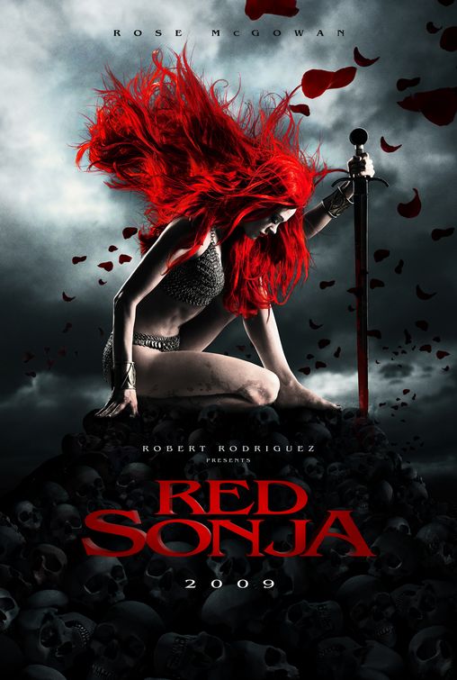
Hair Color: http://www.impawards.com/2009/posters/red_sonja_ver2.jpg
you know... RED! heh
Clothing 1500s - 1700s
(no guns, no skirt)
Should be a stylish mix of believable traveler's gear and looking good! Man's clothing, female cut
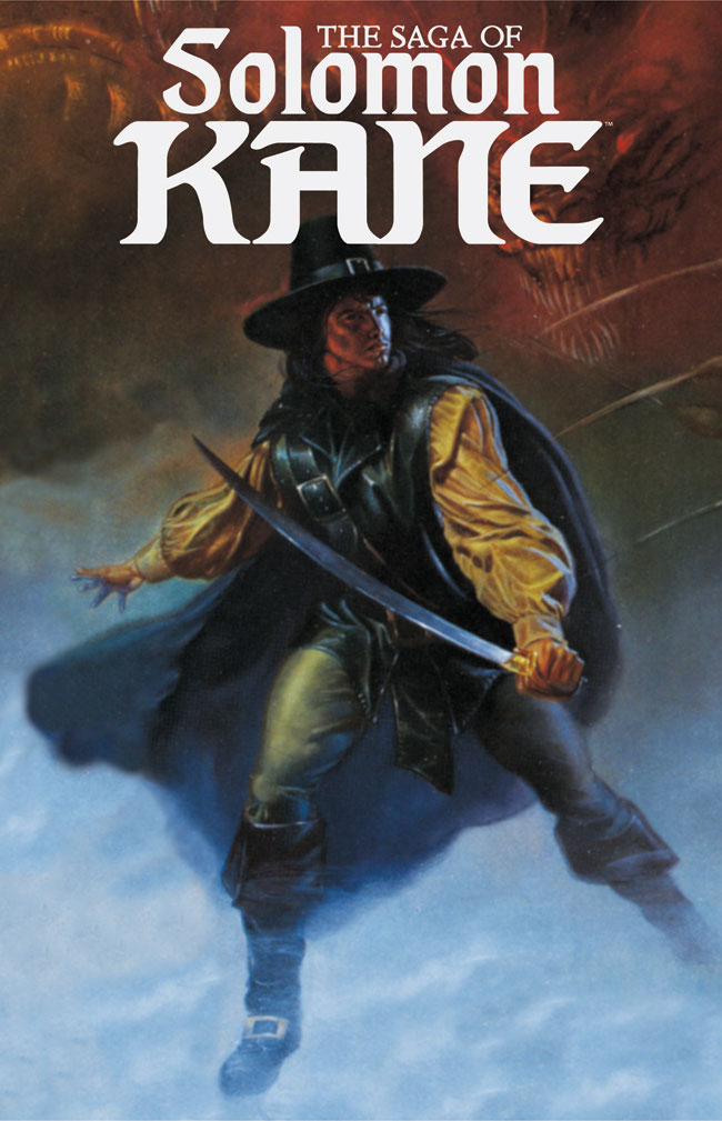
http://www.catskillcomics.com/grell/SOLOMON%20KANE.jpg
http://dungeonhack.webcindario.com/SolomonKaneCommission.jpg
http://www.majorspoilers.com/wp-content/uploads/2009/01a/darkhorseapril09/SagaOfSolomonKane.jpg
http://www.benespen.com/storage/Solomon_Kane.jpg
http://www.season-of-mist.com/common/bands/arcturus/arcturus.jpg
http://img12.nnm.ru/5/f/d/6/b/5fd6baf34a177c35dfc7fb3112a363af.jpg
.. Of course, since there's no costume budget to worry about anymore, there's always the fancier stuff:
http://www.pirates-cave.com/moviecostumes.htm
Sword:
http://jan.ucc.nau.edu/~wew/images/rapier14.jpg
http://bjorn.foxtail.nu/images/barta_a14-.jpg
http://bjorn.foxtail.nu/images/barta_a15-.jpg
and
Some ideas for the artwork.
Coverformat- Self explanatory. No matter what the art is, this stuff is going to be over it.
Idea A- For reference, this was the idea for the cover when it was going to be a photo. The shield was there only to obscure the transition point from snake to person on the monster, since that was going to be where it looked most fake. I figure since that's not an issue now, I figure we don't need a shield to take up space.
Idea B- Here's one idea I had. (it's also the only one of these that suggests both these people are going to have A LOT OF HAIR) The moment the monster reveals itself, and there's the other one going for her sword. I like this idea for its suggestion of action to come, but it's also been done to death: http://index.rpg.net/pictures/show-water.phtml?picid=7734
http://index.rpg.net/pictures/show-water.phtml?picid=8376
http://index.rpg.net/pictures/show-water.phtml?picid=7024
Just some examples.
Idea C- Flame Princess just walking along in the woods minding her own business, doo de doo... When the monster creeps up behind her, ready to strike! I don't know that this is a dynamic cover concept though.
Idea D- Monster rises out of the snow where it's been hiding, ready to pounce on the prey! The Flame Princess crouches and shields herself from the flinging snow.
Idea E- Flame Princess walking along, doo de doo, but she knows something is up and is going for her sword, and here's the monster at the point of contact after sneaking up. Again, I dunno about how exciting a cover this makes.
Idea F- Flame Princess walking along with a walking stick, but from a different angle, and here's the monster creeping out behind some trees. Same issue with it being a not-exciting cover, I seem to have a lot of those ideas. :P
My issues:
Do you think the monster is better served with 4 (or 6) arms, or will the nature of the snake-body be enough to make it all weird and stuff? However many arms it has, I hope you have ideas for its pose beyond "RAR, I am a monster with arms outstretched, RAR!"
You're the artist, you know what works best as a picture, and what you can do best, better than I. I guess we need to figure out the pose as well as the rough format of the cover - how much of the space the figures will actually take up is probably an important decision! :)


Thanks for posting this, I love behind-the-scenes stuff. That cover is perfect.
ReplyDeleteJames, I dig the final cover and look forward to checking out the game upon its release. (I recently contacted you regarding Death Frost Doom and appreciated the response... whether I use it or LoTFP in full or just for ideas andinspiration, I have little doubt I'll use them both.)
ReplyDeleteAnyway, if you're interested in feedback, poses C or E strike me as being less kinetic but more ominous and in tune with what I think you're going for with the game. I'm not trying to be dick or stir the pot or anything... but if you use this concept again for a future, related product I'd love to see one of those two as a full-color cover.
Keep up the great work, my man. Best of luck.
I too like to see the process as it was done. It's too often taken for granted. Sometimes the artwork alone can make the sale, but combined with the inklings you have put forth about "Weird Fantasy", this will be well worth it!
ReplyDeleteCiao!
GW
OK James, you like it blunt, so it here it goes - coming from an artist.
ReplyDelete#1. The idea of having a photograph for a cover is horribly lame. Good for you for not going that route.
#2. "I can't currently afford this kind of art for every release (and I know it seems rather unkind to all the other artists I work with to say that..."
This is not just unkind, this is unprofessional. Yes, some artists are better than others. It is not appropriate, however, for you to go around flaunting this & effectively naming names in a blog post. Talking openly about how you pay one artist far more than another is also a big no-no.
#3. Naked boobies on the cover. Yawn. This is just as tacky as having enormous boobs, or giant swords, etc. It is about taste. It serves no real purpose, & could have been "conveniently" covered with the long hair. Who cares about those who are provocative by being provocative? The sign of greatness is being provocative with something that isn't provocative.
Take Alexander the Great. He led an army, traveling over & conquering large parts of the world with his military might. Yawn.
Compare that to a Jewish carpenter who never traveled anywhere. He never wielded a sword, & died a humiliating death. And yet He changed the world & is the most influential Person in all of human history. Now THAT is something!
#4. The color scheme of the cover piece is drab, dull, blah.
The palette appears to consist almost entirely of white, gray, & red. In a full color piece, you want to use as much color, & as little or B&W/gray as possible. B&W/grays look flat & dull in the midst of color. I understand that this is a snowy, winter scene, but there are ways to paint grays & whites that still look realistic with color. For example, there is a difference between the black from a B&W printer, & the black from a full color printer. One is dull, & the other is very rich, even though they are technically the same "color."
With snow & shadows, where are the deep blues & lavenders in the shading? In the brighter parts of the snow, slight washes of pastels would liven it up some, or even painting white over another color, to make the scenery come alive. Go look at a Frazetta painting. Even in his snow scenes, he uses color, rather than pure white & dull, plain gray.
#5. Is her hair supposed to be that garish red color? It isn't natural looking, as red-heads are more of an orange-ish color. I've only known one person with hair that color red, & it was one of my old freaky looking art teachers.
#6. I like the pose of the red-haired woman. It is dynamic without being cliche or the standard "RAR-of-awesomeness" that all the heroes are posed with on newer game covers. The clothes are ugly, but I guess that is the clothing you were going for. The pose of the snake lady is too defensive for someone who is supposed to be the aggressor.
There's professionalism and then there's professionalism.
ReplyDeleteQuality of art is right there for everyone to see. I'm not going to pretend everything is equal, because it's not. The very purpose of using this artist and paying her fee was to get a piece of art that blew everything else out of the water.
And if pointing out that a cover piece costs far more than an interior black and white piece is "unprofessional," then fuck it, professionalism isn't worth anything.
Marjut's hair is that color.
There is no reason on Earth for the snake demon to be wearing any clothes, and it's corny and hokey and bullshit to have things covering it up so conveniently.
Finland has nice long winters and winter is my favorite season. One thing I love about winter is how color drains out of the world. If someone gave me a colorful snowy landscape I'd kick it back and tell them to fix it.
"#3. Naked boobies on the cover. Yawn. This is just as tacky as having enormous boobs, or giant swords, etc. It is about taste. It serves no real purpose, & could have been "conveniently" covered with the long hair. Who cares about those who are provocative by being provocative? The sign of greatness is being provocative with something that isn't provocative."
ReplyDeleteUhh, I kinda appreciate the boobies...so feel free to be provocative.
"Take Alexander the Great. He led an army, traveling over & conquering large parts of the world with his military might. Yawn.
Compare that to a Jewish carpenter who never traveled anywhere. He never wielded a sword, & died a humiliating death. And yet He changed the world & is the most influential Person in all of human history. Now THAT is something!"
I'd still rather see boobies on the cover than Christ on a cross, or Alexander the Great.
James said, "Quality of art is right there for everyone to see. I'm not going to pretend everything is equal, because it's not. The very purpose of using this artist and paying her fee was to get a piece of art that blew everything else out of the water."
ReplyDeleteThe point is, what you did was effectively run down artists who worked for you IN PUBLIC. If some of your artists are vastly superior than others, it should be apparent, & there is certainly no need to point it out.
James said, "And if pointing out that a cover piece costs far more than an interior black and white piece is "unprofessional," then fuck it, professionalism isn't worth anything."
You & I both know that is not what this is about.
James said, "Finland has nice long winters and winter is my favorite season. One thing I love about winter is how color drains out of the world. If someone gave me a colorful snowy landscape I'd kick it back and tell them to fix it."
I don't think you understand my point about color. I'm not talking about making the background "colorful." Look at the backgrounds of Frazetta's paintings. Many are dark & gray & bleary. But if you look up close to a good scan or print, you'll notice that he didn't use simple blacks, whites, & grays made purely from B&W. He constructed his grays from color, & they made his backgrounds far more compelling & moody. Look at some of these to see what I am talking about:
http://www.flickr.com/photos/jlevar/72688130/
http://www.wizards-keep.com/graphics/RTE/RTEPage-009_Frost_Giants.jpg
http://www.flickr.com/photos/28819674@N03/2691332569/sizes/o/
http://www.arthistoryarchive.com/arthistory/fantasy/images/FrankFrazetta-The-Silver-Warrior-1972.jpg
http://www.flickr.com/photos/cristianrebolledo/1796899294/sizes/o/
At the risk of being unprofessional as well, I'd like to point out that even if Frazetta were still alive (may he rest in peace), he wouldn't have been anywhere near the budget we're looking at here. I really like the dreary winter landscape, which is very different from what Frazetta was going for in those examples.
ReplyDeleteAlso, let's remember this wasn't intended as high art for a gallery wall, this is commercial art for an RPG box. There's going to be text on that gray! The cover of No Dignity In Death was very effective and eye-catching with the red jumping out of contrasting white and gray, and this has a similar effect.
I agree when it comes to business matters, it's not helping anyone to say "oh yeah, that's great" if it's not, it's better to be blunt and to correct things before they go to market, because a blow to one's business and wallet are much more permanent and painful than a blow to one's ego. In this case though, I think the art is excellent. I much prefer this over the cover for the planned Magic book.
>>The point is, what you did was effectively run down artists who worked for you IN PUBLIC.
ReplyDeleteHorseshit. I didn't run anybody down. I like every single artist that's going to appear in the box.
There are a good many people I could run down, for real, but they won't have any work in the box.
>>I don't think you understand my point about color.
And I don't think you understand my taste in these things.
It is considered bad form to talk about how much you pay an artist in public because future employers are going to read this and then tell the artist that 'oh such and such paid you this much for x quality result so I'll pay the same'. The truth of the matter is an artist might be doing you a favour (because they like you or want to support your good roleplaying game) and working under their normal wage. They don't want this to be public knowledge when working with people with whom they might have a more professional relationship (i.e. they don't like enough to cut price on)
ReplyDeleteYou're effectively making every artist that has worked for you for under their normal price to have to say to people "see, I did that for Jim because he's my friend... you... are not my friend'.
And that's not the end of the world to have to say, some artists are fine with that. But you shouldn't have made their choice for them.
If before posting this you have talked with every artist explicitly or implicitly mentioned and agreed with them that they don't mind the behind the scenes look and especially the value exchange details being in the open, that's fine.
On the quality of the cover: it's a very well-done cover. The photo reference toil shows. The palette is indeed heavy on the desaturated forms but that makes the flame princess pop more, I do not think 'if you're working with color artwork you should have as much color as you can in there' is dictum. However (and this is a really easy fix with color balance in photoshop) the snow palette could use a very very slight tint in its shadows towards teal.
>>If before posting this you have talked with every artist explicitly or implicitly mentioned and agreed with them that they don't mind the behind the scenes look and especially the value exchange details being in the open, that's fine.
ReplyDeleteI didn't mention any numbers in the post. I mean, I made clear that the cover cost me more than $250 but surely that's no great secret.
True but the implication that 250 dollars is a cost "far more than any previous project's TOTAL budget" buts the interior artists in a ballpark.
ReplyDeleteI said: "just the front cover for this box has cost far more than any previous project's TOTAL budget"
ReplyDeleteAnd I've said that the front cover cost more than $250. I still didn't give any numbers, although I certainly will reserve the right to give out my total budgets.
For example, this box set's budget is sitting at 10000€.